Common mistakes in retail display design and how we can avoid them
Some retail store owners believe success depends entirely on product selection and price. While these factors are essential to attracting shoppers to the store and convincing them to buy, would you be curious if I told you there was more information relevant to the purchase?
An attractive, logical, user-friendly retail presentation that helps you at every step of the way. Running an attractive store doesn’t just mean putting goods on shelves. How should we do that? Please continue reading. Let’s explore the four most common mistakes store owners make in retail store display design. It’s even more important to understand how to avoid these mistakes to prevent them from affecting your sales.
#1: Route Chaos Retail Display Design Mistake
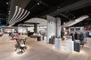
Mistake: Narrow, uneven or curved paths disrupt smooth traffic throughout the store, making shopping uncomfortable. Not only do shelf units, POP display shelves and walkways between display shelves need to be wide enough for shoppers to browse comfortably, but the overall design also needs to facilitate traffic flow.
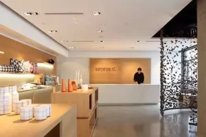
Tips to avoid this error: Keep a fast path to the checkout counter and door. Take advantage of your location-spacious spaces should display eye-catching display items to attract shoppers.
#2: Shelf design lacking cohesion Retail Display Design Mistake
Mistake: If you use too many different types of shelves and shelving systems in your store, it will affect the performance of your products and even the psychological state of your shoppers. Wood here, shiny metal there and mismatched glass displays can lead to visual clutter, which can exacerbate discomfort and anxiety.
Tips to avoid this error: Decide on a display solution and stick with it. Eclectic is fine and works well in many stores, but tie your look and feel to similar elements and complementary designs. For example, choose warm wood for household items, smooth metal for high-tech gadgets, and acrylic boxes for jewelry display props.
#3: Quantity and Variety of Products Retail Display Design Mistake
Error: Too many products or multiple types of products displayed together can cause confusion and confusion. In smaller retail stores, twenty identical shirt racks give the impression that you don’t offer a variety of goods. Having ten different individual products on the shelf can upset hesitant shoppers, which makes it harder to decide what to buy.
Tips to avoid this error: balance is key. Identify the products you want to push and highlight some of them. Put similar items together, but don’t overwhelm shoppers with too many choices. Leave comfortable space around things. No one wants to shop from such a crowded display rack, where moving a product could cause an avalanche of nearby items.
#4: Poor Lighting, Air Circulation and Other Building Issues Retail Display Design Mistake
Mistake: Every retail store has built-in factors that affect shopper comfort. The indicator light should correctly highlight the product. Vents should not blow directly where shoppers stand at checkout lines or lightweight point-of-sale displays.
Tips to avoid this error: Pay attention to lighting and airflow. Keep shoppers focused on things other than bathroom doors, fire extinguishers, changing rooms, or other necessary but unattractive things.
All retail stores need a functional and feel-good display layout and design that fits your product type as well as your customers ‘interests and habits.
Do you need help? If you’re looking for a unique, stunning display to take your retail merchandise experience to the next level, contact us today. We can’t wait to show you what we can do for you!


